
Clear, engaging online lessons your people can actually use, built for your platform and your timeline
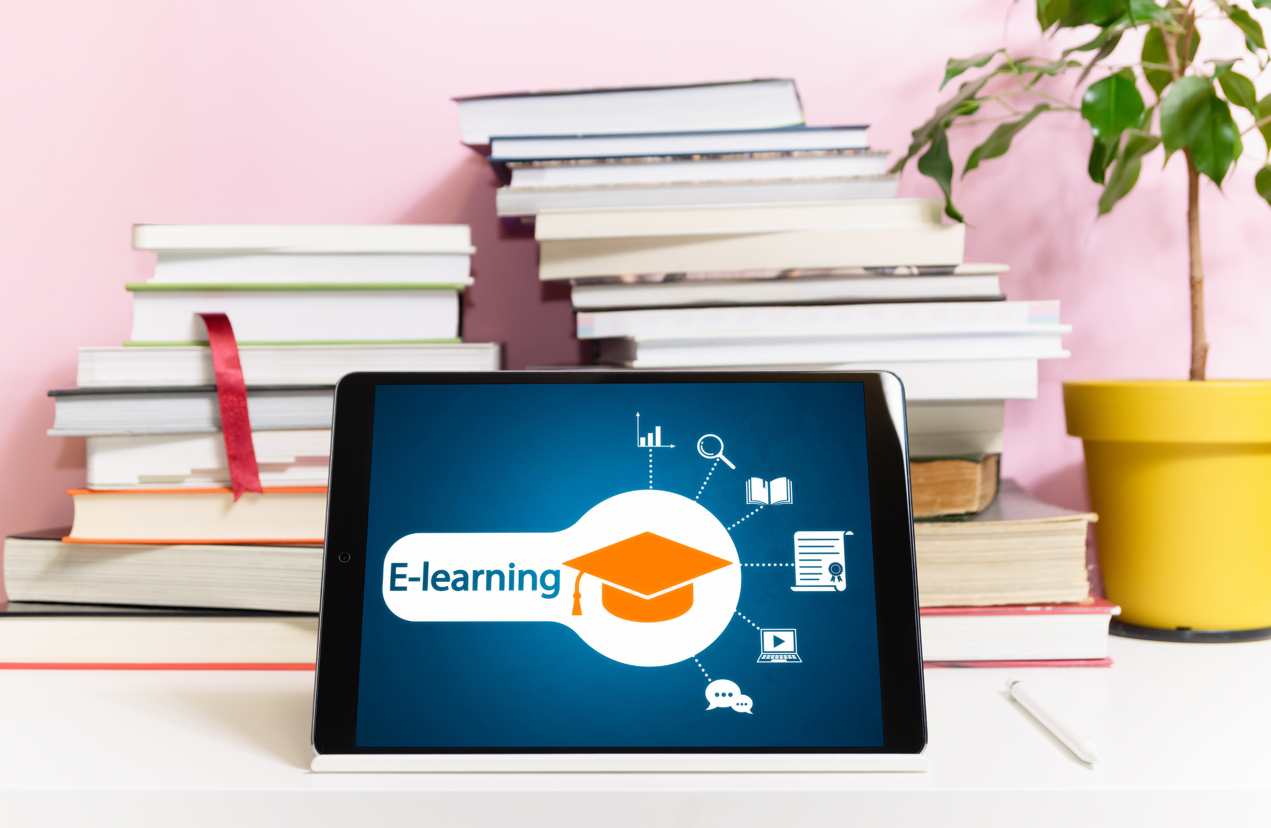
Accessible E-Learning Design that Turns Expertise Into Action
Your team deserves training that works
Many organizations struggle with:
Content that’s accurate, but hard to follow
Trainings that feel too long, too dense, or too generic
Low completion or low transfer to real work
Accessibility issues (captions, documents, screen reader support, color contrast)
Subject matter experts stretched too thin to “own” course development
You shouldn’t have to choose between speed, quality, and accessibility. I design e-learning that respects people’s time, supports diverse learners, and makes the “what to do next” unmistakably clear.
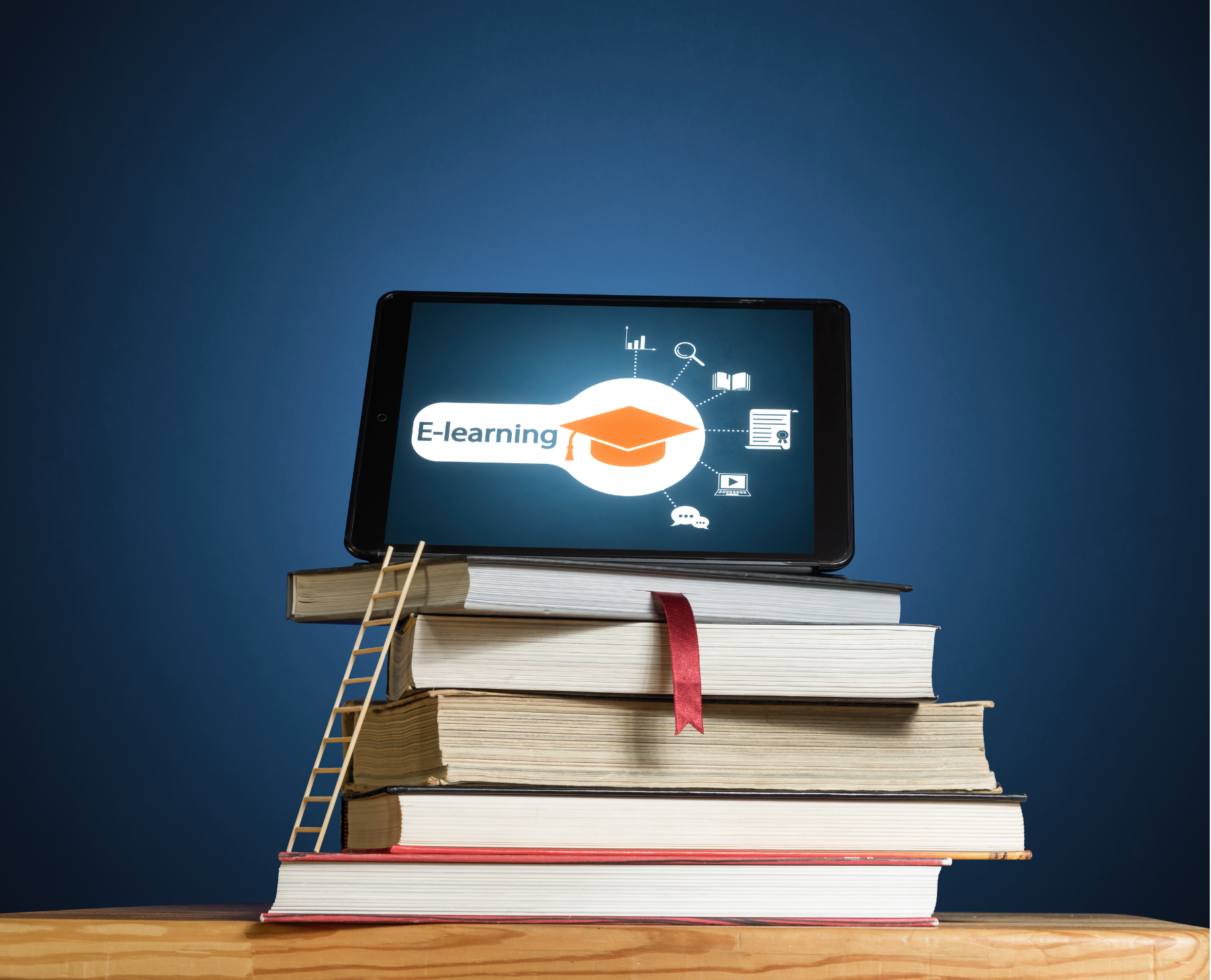
Why E-Learning Expectations are Rising
Learners expect shorter lessons, practical practice, and content that works on any device. At the same time, accessibility expectations are increasing across K–12 and beyond—especially for public-facing digital content and training materials. Designing with accessibility in mind from the start reduces rework and helps ensure everyone can participate.
If you train people, this is for you

School districts (K-12 teams)
Compliance-ready training, practical job aids, busy schedules
Public sector/nonprofits
Consistent, accessible learning for distributed teams
Small businesses
Turn your process into a course without building a whole L&D department
Association/member orgs
Scalable learning for onboarding and continued education
Internal teams (HR, Operations, Programs)
SOP-to-course conversions that stick

How I Build Accessible, Practical E-Learning
Your course is designed to be understandable, doable, and easy to maintain.
Right-sized lessons - microlearning when it makes sense; no unnecessary length
Practice that mirrors real work - scenarios, decision points, quick checks
Job aids and templates people can use immediately
Built for your platform - LMS, Google-based workflows, Articulate, etc.
Accessibility by design - clear headings, readable structure, captions/transcripts, contrast-aware visuals, keyboard-friendly interactions
E-Learning Options
Best for: Testing a topic, format, or audience before scaling district-wide.
What you get: One short, accessible module with clear outcomes, practice checks, and a plan for what to build next.
Best for: Busy staff who need quick, focused support (5–10 minutes at a time).
What you get: A set of mini-modules that target one task or decision each, designed for easy refreshers and just-in-time learning.
Best for: District-wide training, onboarding, or annual requirements where consistency matters.
What you get: A complete course with pacing, knowledge checks, and practical application, built to be reused and updated over time.
Best for: Reducing errors and repeat questions during real work.
What you get: Accessible, printable and digital tools like checklists, one-page guides, templates, and quick-reference visuals that staff can use in the moment.
Best for: Standardizing how work gets done across buildings, teams, or roles.
What you get: Step-by-step procedures turned into clear, searchable learning supports (guided walkthroughs, decision steps, and “what to do when” prompts).
Best for: When information is scattered across emails, slide decks, and shared drives.
What you get: A centralized, easy-to-navigate collection of resources (short lessons, FAQs, job aids, and links) organized so staff can find answers quickly.
Not every need calls for a full course. I help districts and small businesses choose the simplest format that solves the real problem, whether that’s building staff knowledge, supporting consistent procedures, or reducing repeat questions.

Best for: Demonstrating tools, processes, or routines staff need to copy.
What you get: Short instructional videos with captions, transcripts, and supporting job aids, designed for quick replay when staff get stuck.
Not sure what you need yet? We can start with a short discovery and recommend the format that fits your goals, timeline, and staff capacity.
Why choose KShep Creative for E-Learning development?


Practical Outcomes
Learning that leads to action, not just awareness
Accessibility-First
Designed so more people can participate from day one
Low Lift for SMEs
Structured prompts and flexible review windows
Respect for Time
Efficient cycles that fit real calendars
Transparent Process
You’ll always know what stage we’re in and what’s next
Reusable Assets
Templates and job aids that you can keep using
Your E-Learning Questions, Answered
-
E-Learning is any learning or guidance delivered digitally so staff can access it anytime, anywhere. In districts, it might be a full online course, but it can also be shorter and more practical, like a mini-module, a checklist, a job aid, a quick video, or a step-by-step procedure. The best format depends on the problem you’re trying to solve and what staff need to do differently.
-
Turning an in-person training into eLearning makes it easier for staff to access and use. People can complete it on their own schedule, revisit it when questions come up, and quickly find the information they need without waiting for the next training date. It also reduces repeat work for your team: instead of presenting the same session every year and answering the same questions, you can build the training once, update it as needed, and reuse it for future onboarding, refreshers, and annual requirements.
-
E-Learning works especially well in K–12 when staff need clear, consistent guidance that they can access anytime. Common district projects include: staff onboarding modules; required compliance and policy trainings; teacher and staff professional development; microlearning for quick “how-to” skills; curriculum and instructional practice support (videos, exemplars, and discussion guides); step-by-step procedures and job aids for tools and systems; and resource hubs that organize materials in one place. The right format depends on your goal, your audience, and how often the information changes.
-
I design eLearning so your team can maintain it without needing a specialist. That includes using clear, reusable templates; organizing files and labels consistently; and keeping layouts simple so updates are fast and low-risk. At the end of the project, you receive editable source files, a short “how to update” guide, and a walkthrough or training for the staff who will own the content going forward.
-
I typically bill $100/hour. For many eLearning projects, I can also offer a project-based price when we agree on a clear scope up front (deliverables, review rounds, timeline, and what’s included). If the scope changes, I’ll flag it early, and we can either adjust the fixed price or switch to hourly for the added work.
-
I build accessibility in from the start, not as an add-on at the end. That means I design and test each deliverable to align with current K–12 digital accessibility expectations (including WCAG 2.2 Level AA and ADA Title II requirements). In practice, that includes:
Clear structure and navigation: logical headings, consistent layouts, and predictable interaction.
Screen reader support: meaningful text, proper reading order, accessible buttons, and alt text for images.
Captions and transcripts: for any audio or video content.
Color and visual accessibility: sufficient contrast, no color-only instructions, readable fonts and spacing.
Keyboard access: activities and controls work without a mouse.
Plain language: so staff can understand content quickly and accurately.
Before handoff, I run an accessibility quality check (using both automated tools and human review) and share a short summary of what was tested and any known limitations with recommended fixes.
-
Small businesses get the most value from E-Learning when it saves time, supports consistent service, and reduces “tribal knowledge.” Common projects include: employee onboarding and role training; standard operating procedures (SOPs) and step-by-step how-to guides; customer service and sales playbooks; product or service training; quick microlearning modules for new tools or processes; compliance and safety refreshers (when relevant); and resource hubs that organize templates, checklists, and FAQs in one place. The best format depends on what you need staff to do consistently and how quickly the information changes.